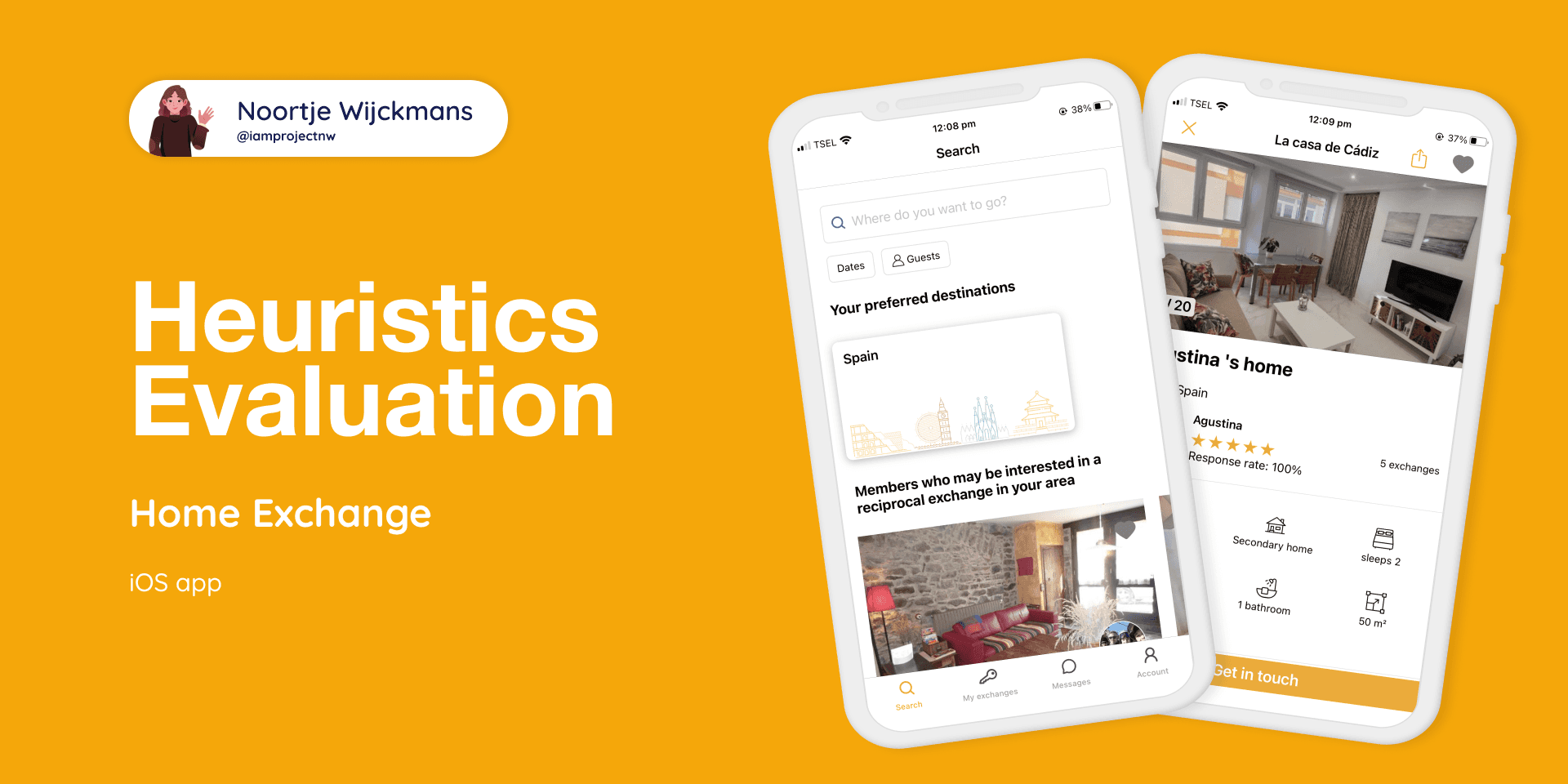
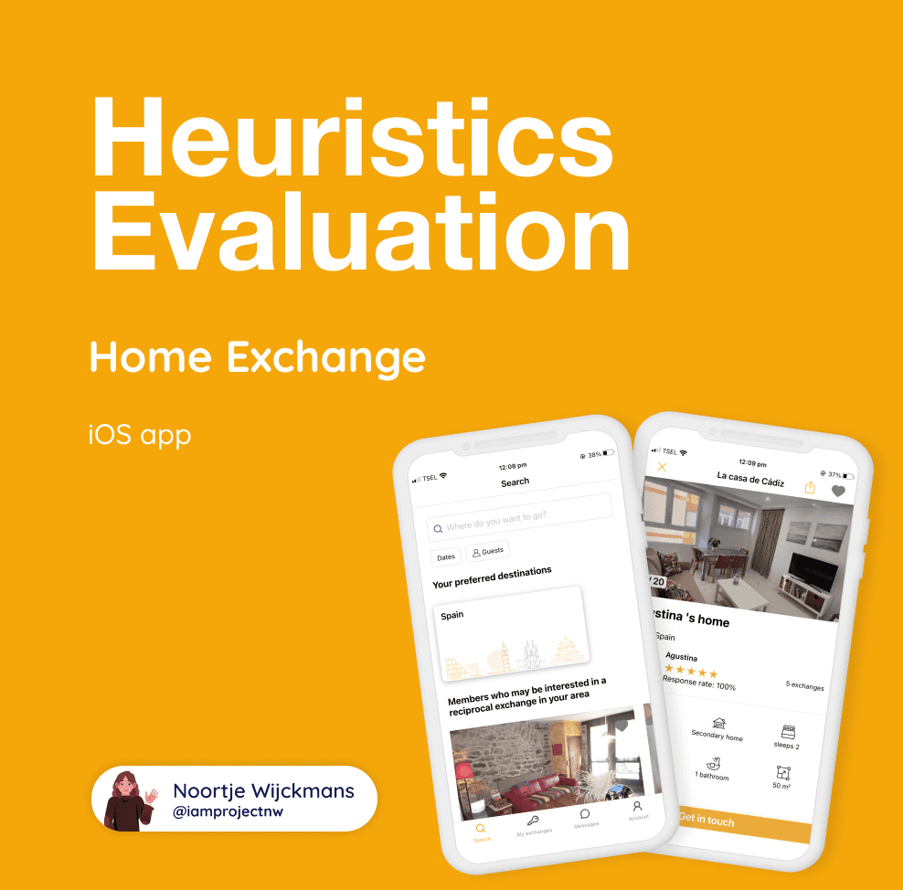
iOS | Mobile design | Heuristics
Home Exchange is a platform where users can use their home to travel more responsibly.
They are the world leader in home exchange vacations. With over 150,000 members in 145 countries, discover an affordable, authentic and safe way to travel the world. Discover how you can exchange homes for your next vacation.
I am not affiliated with HomeExchange.
Heuristics
For this heuristic evaluation of the HomeExchange iOS app, I used Jakob Nielsen's 10 general principles for interaction design.
Visibility of system status
The design should always keep users informed about what is going on, through appropriate feedback within a reasonable amount of time.
Consistency and standards
Users should not have to wonder whether different words, situations, or actions mean the same thing. Follow platform and industry conventions
Flexibility and efficiency of use
Shortcuts — hidden from novice users — may speed up the interaction for the expert user such that the design can cater to both inexperienced and experienced users. Allow users to tailor frequent actions.
Help and Documentation
It’s best if the system doesn’t need any additional explanation. However, it may be necessary to provide documentation to help users understand how to complete their tasks.
Match between the system and the real worls
The design should speak the users' language. Use words, phrases, and concepts familiar to the user, rather than internal jargon. Follow real-world conventions, making information appear in a natural and logical order.
Error prevention
The best designs carefully prevent problems from occurring in the first place. Either eliminate error-prone conditions, or check for them and present users with a confirmation option before they commit to the action.
Aesthetic and Minimalist Design
Interfaces should not contain information that is irrelevant or rarely needed. Every extra unit of information in an interface competes with the relevant units of information and diminishes their relative visibility.
User control and freedom
Users often perform actions by mistake. They need a clearly marked "emergency exit" to leave the unwanted action without having to go through an extended process.
Recognition rather than recall
Minimize the user's memory load by making elements, actions, and options visible. The user should not have to remember information from one part of the interface to another. Information required to use the design (e.g. field labels or menu items) should be visible or easily retrievable when needed.
Help Users Recognize, Diagnose, and Recover from Errors
Error messages should be expressed in plain language (no error codes), precisely indicate the problem, and constructively suggest a solution.
Source: https://www.nngroup.com/articles/ten-usability-heuristics/
Evaluation
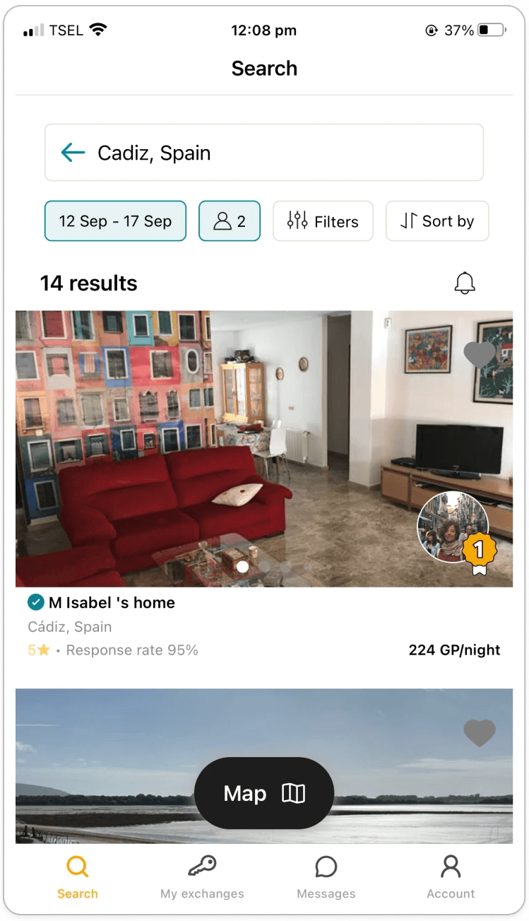
I reviewed the screens of the main user flow: booking a home exchange.
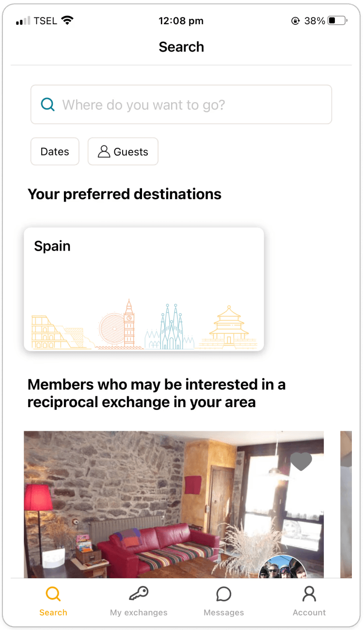
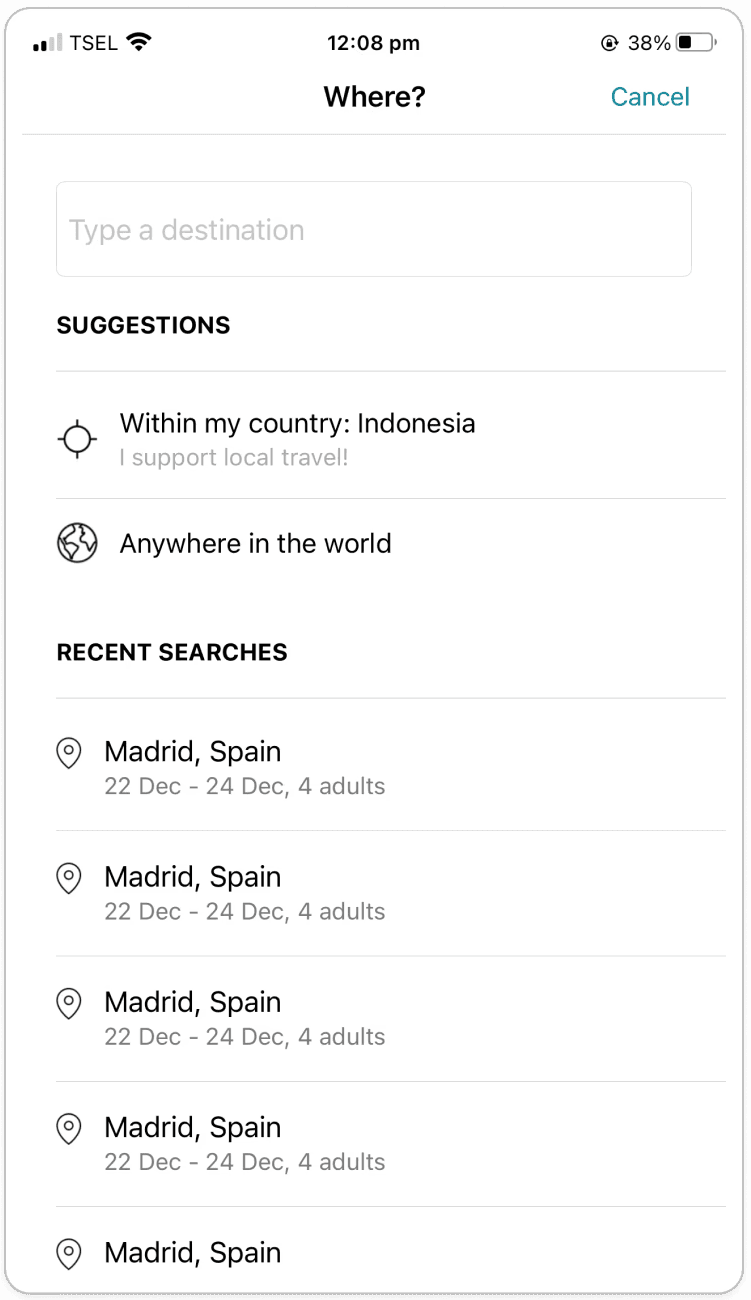
Screen 4: Date selection
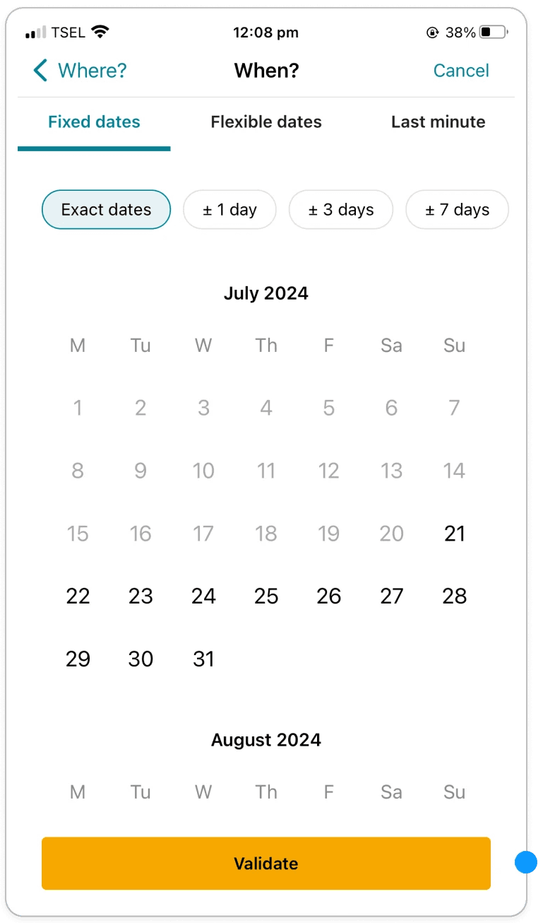
Match between the system and the real worls
Observation:
The button label ‘’Validate’’ does not match with the user’s action of submitting the information.
Recommendation:
Change button label to ‘’Submit’’ or ‘’Continue’’
Cosmetic
Screen 5: Date selection
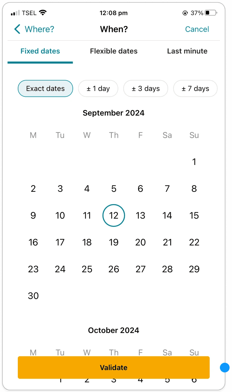
Match between the system and the real worls
Observation:
The button label ‘’Validate’’ does not match with the user’s action of submitting the information.
Recommendation:
Change button label to ‘’Submit’’ or ‘’Continue’’
Cosmetic
Screen 6: Date selection
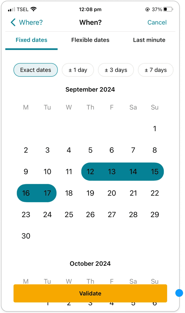
Match between the system and the real worls
Observation:
The button label ‘’Validate’’ does not match with the user’s action of submitting the information.
Recommendation:
Change button label to ‘’Submit’’ or ‘’Continue’’
Cosmetic
Screen 7: Guest selection
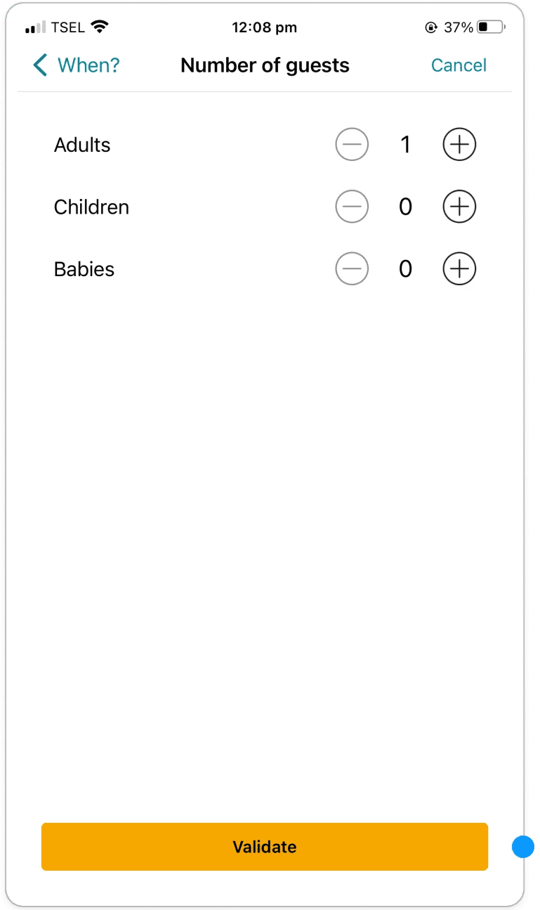
Match between the system and the real worls
Observation:
The button label ‘’Validate’’ does not match with the user’s action of submitting the information.
Recommendation:
Change button label to ‘’Submit’’ or ‘’Continue’’
Cosmetic
Screen 11: Exchange request - Dates
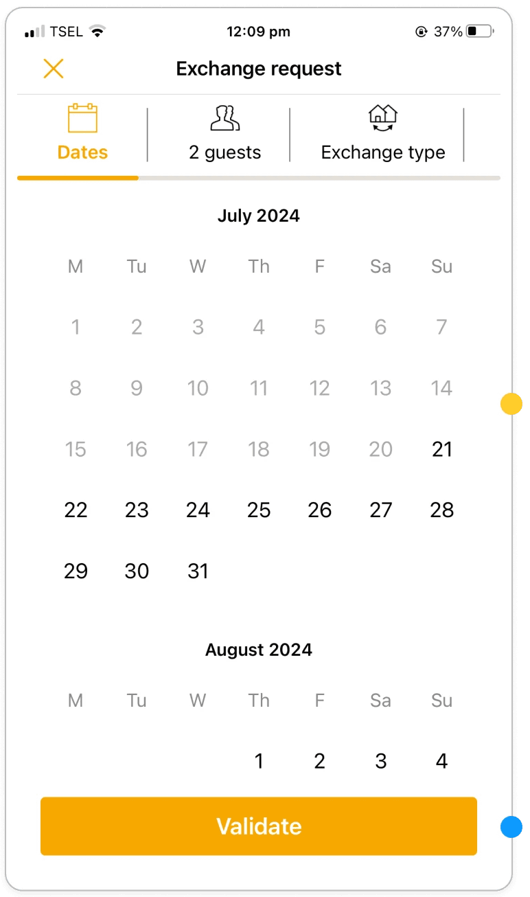
Recognition rather than recall
Observation:
User has to re-enter the dates they want to book
Recommendation:
Don’t make users recall which dates they picked, instead make sure it’s saved from the search query.
Critical
Match Between the System and the Real World
Observation:
The button label ‘’Validate’’ does not match with the user’s action of submitting the information.
Recommendation:
Change button label to ‘’Continue’’ or ‘’Next’’
Cosmetic
Screen 12: Exchange request - Exchange type
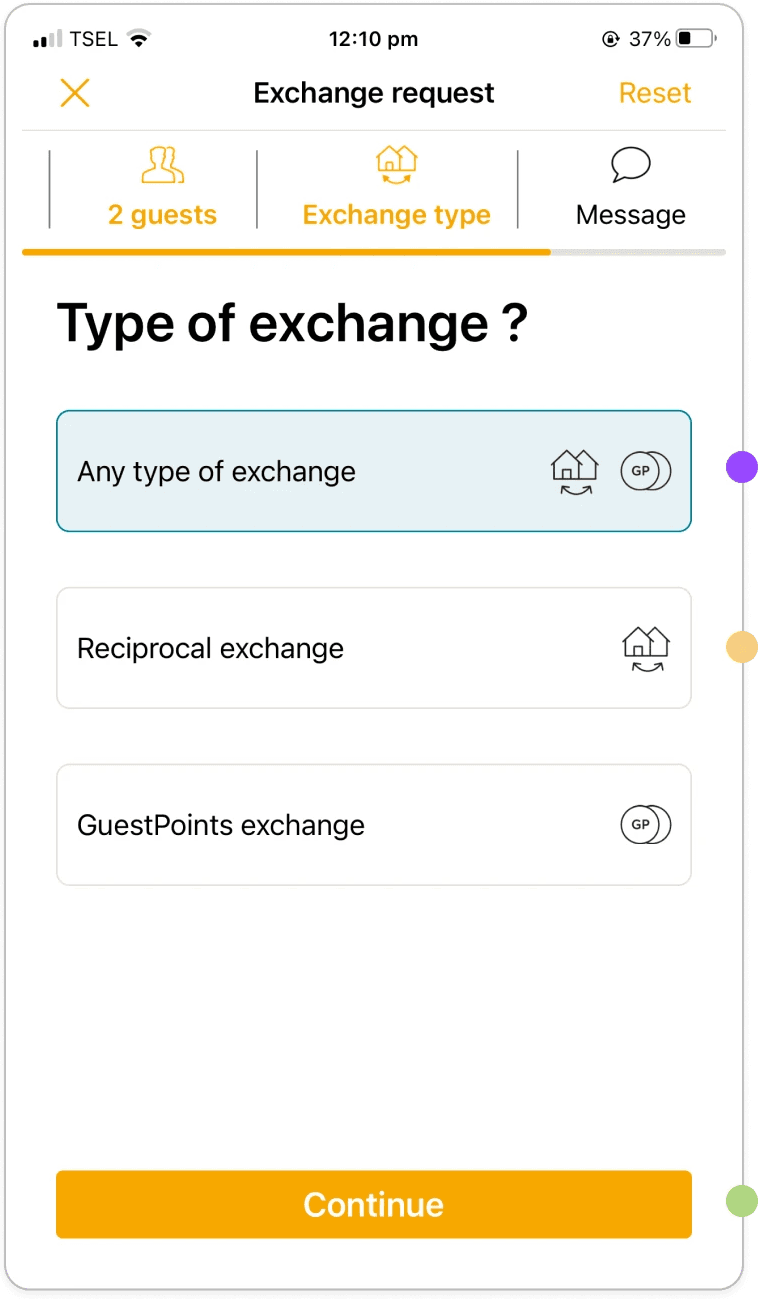
Flexibility and Efficiency of Use
Observation:
Each time the user wants to book an exchange, they have to select their desired exchange type.
Recommendation:
Allow users to set a default exchange type.
Cosmetic
Help and Documentation
Observation:
There is no additional information or help button available on the Exchange type selection screen.
Recommendation:
Have a short description of each Exchange type below the title, or a ? icon where users can click to find more information.
Moderate
Consistency and Standards
Observation:
Button label reads ‘’Continue’’ while previously it was ‘’Validate’’
Recommendation:
Keep the button label in the user flow and across the app consistent, either stick with ‘’Continue’’ or ‘’Validate’’.
Moderate
Screen 12a: Exchange request - Exchange type
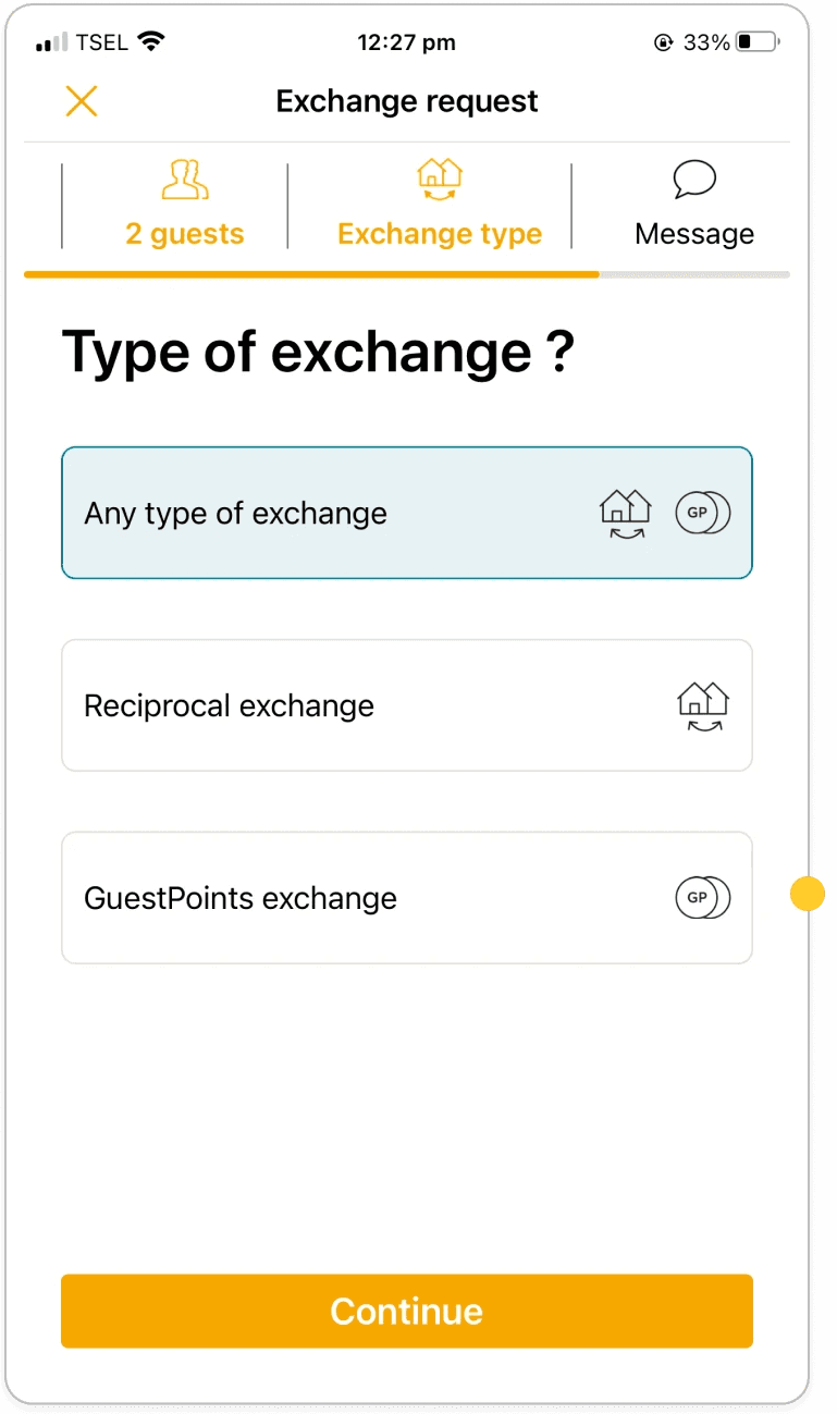
Recognition Rather than Recall
Observation:
When the user goes back to the exchange type screen, their initial selection is removed.
Recommendation:
Make sure the user selection isn’t reset to ‘’Any type of exchange’’ when they return to the previous screen.
Critical
Screen 13a: Exchange request - Message
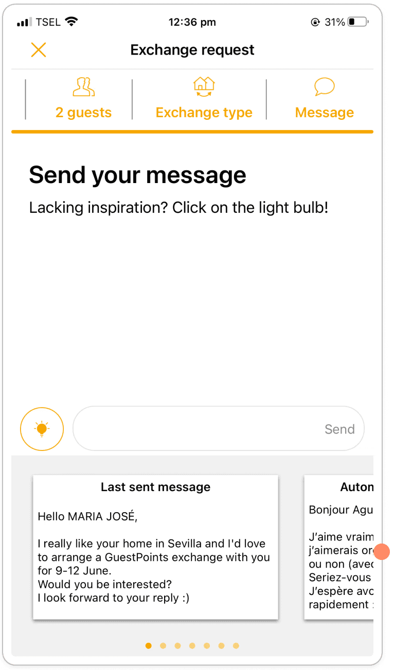
Error Prevention
Observation:
The previous initial message sent is shown as the first template, which included a different location and dates.
Recommendation:
Instead of having the previous initial message as the first template, suggest a standard template that doesn’t include location or date information.
Critical
Screen 13b: Exchange request - Message
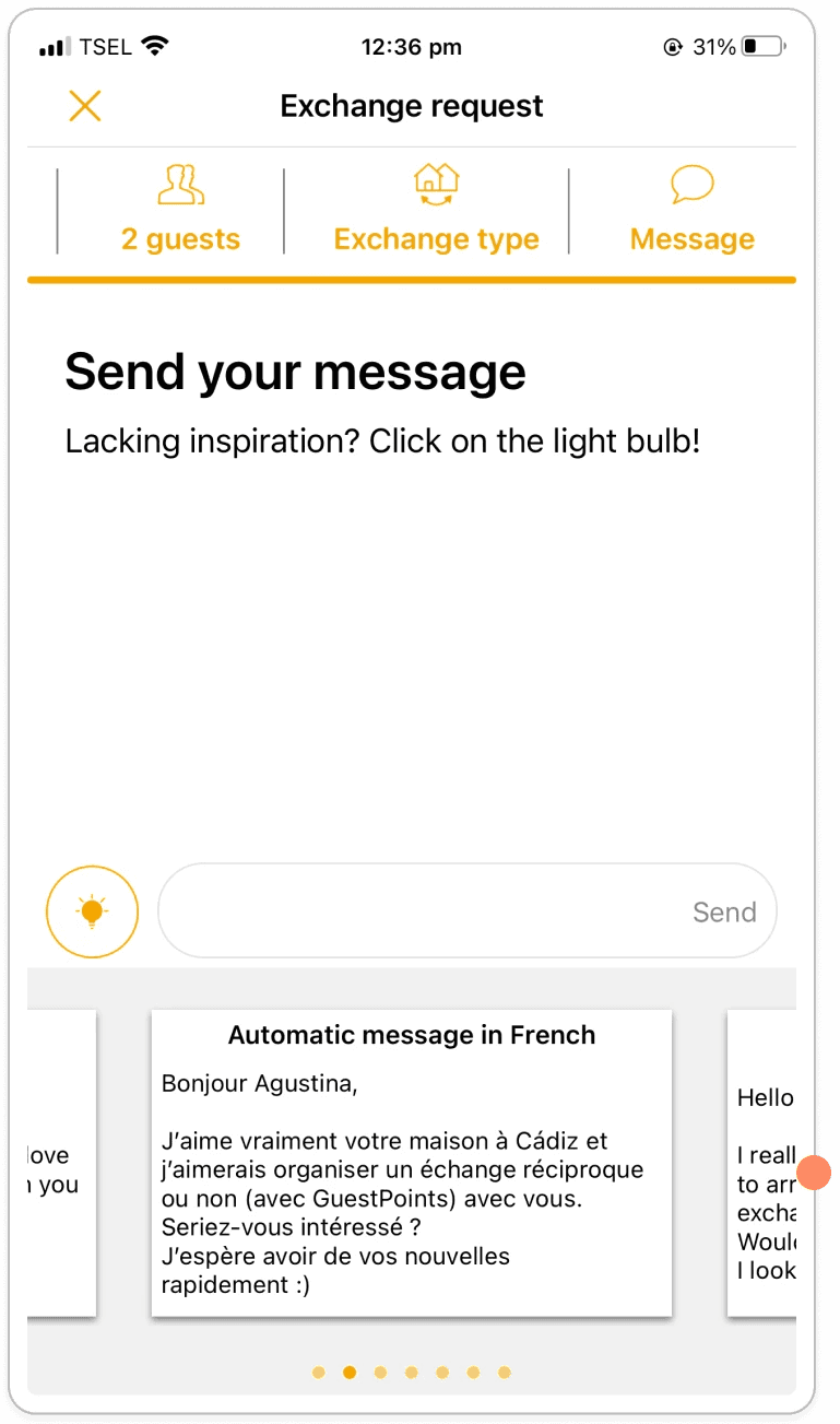
Error Prevention
Observation:
The second suggested message is a template in a language neither the user nor the host has as their native language.
Recommendation:
Instead of suggesting a language that’s not relevant to the location, nor the user itself, suggest a template in English and then one in the host language.
Critical
Screen 13c: Exchange request - Message
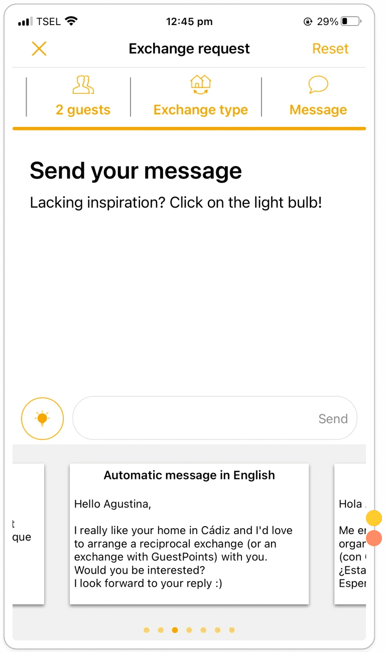
Error Prevention
Recognition Rather than Recall
Observation:
The third suggested message didn’t change according to the users selection of exchange type.
Recommendation:
Make sure message template reflects the users selection for exchange type.
Critical
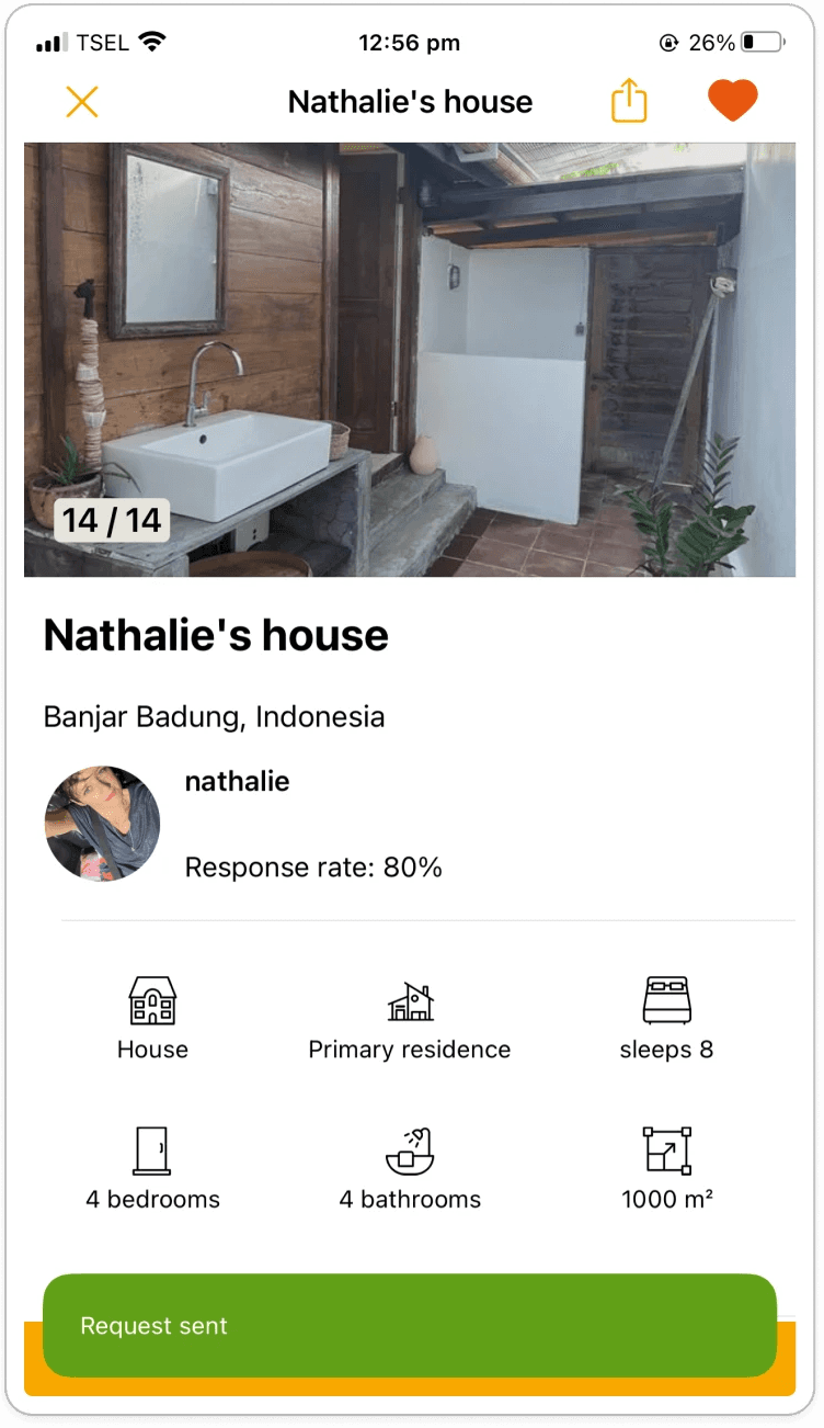
Screen 17: Exchange details
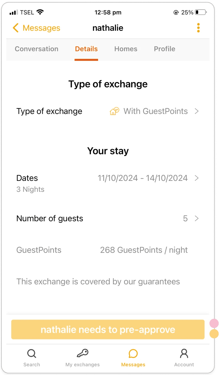
Visibility of system status
Help and Documentation
Observation:
Button says ‘’Nathalie needs to pre-approve’’, but there is no further information on what this means for the user.
Recommendation:
Instead of a disabled button, display information about the process of booking a home exchange and where the user is at in the process, what the next step is, and what they can expect.
Moderate