

Hotel Aggregator Website
Diploma Project | UX Design | Research
Challenge
Design a hotel booking experience for a single use case.
Timeline
1 Month
Skills
UX Research, Analysis, Prototyping
An industry focused on sales, not users.
Booking a hotel can be a cumbersome task, with countless options available. Whether you book directly through a hotel's website or use aggregators like Booking.com or Hotels.com, the goal remains the same: find, compare, and secure the best deal. However, through my research, I discovered significant usability issues with these aggregator sites, prompting me to tackle one of the most critical challenges.
To gain a deeper understanding of the context in which people book hotels, uncover user pain points and discover what users enjoy about the current booking platforms. The online survey involved a sample size of 10 participants from various demographics and regions.
Questions revolved around:
Which hotel booking website is commonly used.
Were you able to complete your task that day?
Why did you visit the hotel website that day? What were you trying to do?
How would you rate your satisfaction with finding hotels matching your preferences on the website?

Strengths:
The homepage of Booking is the most intuitive and user friendly, as it provides only the most important options, clearly labeled without cluttering the interface.
Weaknesses:
While offering highly customisable search functionality, however some functionality wasn’t taken into account when displaying search results.

Strengths:
Search results and room selection is highly intuitive and has a clean UI. It gives the user clear customisation options.
Weaknesses:
The home page is cluttered, with lots of elements and buttons that distract users from their main purpose of visiting: Searching for a hotel.

Strengths:
Room selection is intuitive and allows users to apply filters to narrow down their search quickly.
Weaknesses:
Use of ads, pop-ups and other distracting elements throughout the flow.
The full price of the booking isn't shown until the final payment page, and there's use of dark UX elements such as a countdown timer to make users feel pressured into making a decision quickly.

Strengths:
Intuitive and clean design throughout the entire booking flow.
Many filtering options that allow the user to quickly identify the right property for them.
Weaknesses:
Currency and language selection doesn't work.
To explore usability issues with the existing hotel websites out there
I did a usability test with three people of different ages and backgrounds. Two of their usability tests were with individual hotel websites, and one was with a hotel aggregator website.
Some of the tasks included:
Book a hotel room in Barcelona, with breakfast included and free cancellation
Book a twin room in one of the London hotels, preferably with breakfast included


THE PROBLEM
The primary challenge I identified was simplifying and clarifying customisation options during the booking process.
Analysis
To achieve a comprehensive understanding of the research results, I utilised the following analysis methods:
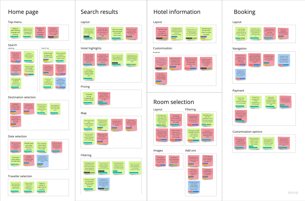
Affinity diagram
I combined all research findings into a clear overview using an affinity diagram. This allowed me to analyse industry and niche research alongside usability findings to prioritise issues for the redesign.
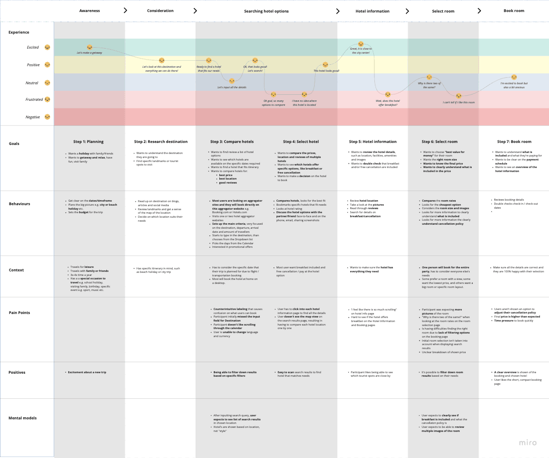
Customer Journey Map
To gain a holistic view of the customer experience, I created a Customer Journey Map to uncover moments of both frustration and delight throughout the booking process on a hotel aggregator website.
THE HYPOTHESIS
How can I simplify the booking process, ensuring users can easily customise their bookings, thereby increasing satisfaction and completion rates?
IDEATION
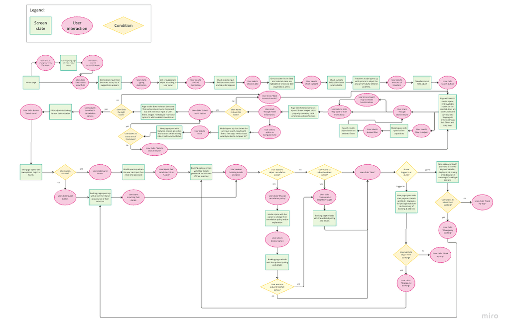
Flow diagram
To get an overview of all the screens and options a user encounters when booking a hotel on an aggregator website, I created a Flow Diagram.
This approach helped me break down the problem into manageable stages, ensuring a structured design process.
IDEATION
Developing the solution
Simplified room selection
Implementing intuitive filters to narrow down room choices based on preferences like room size, beds, and amenities.
Simplifying the selection of cancellation policies and breakfast options during room selection.
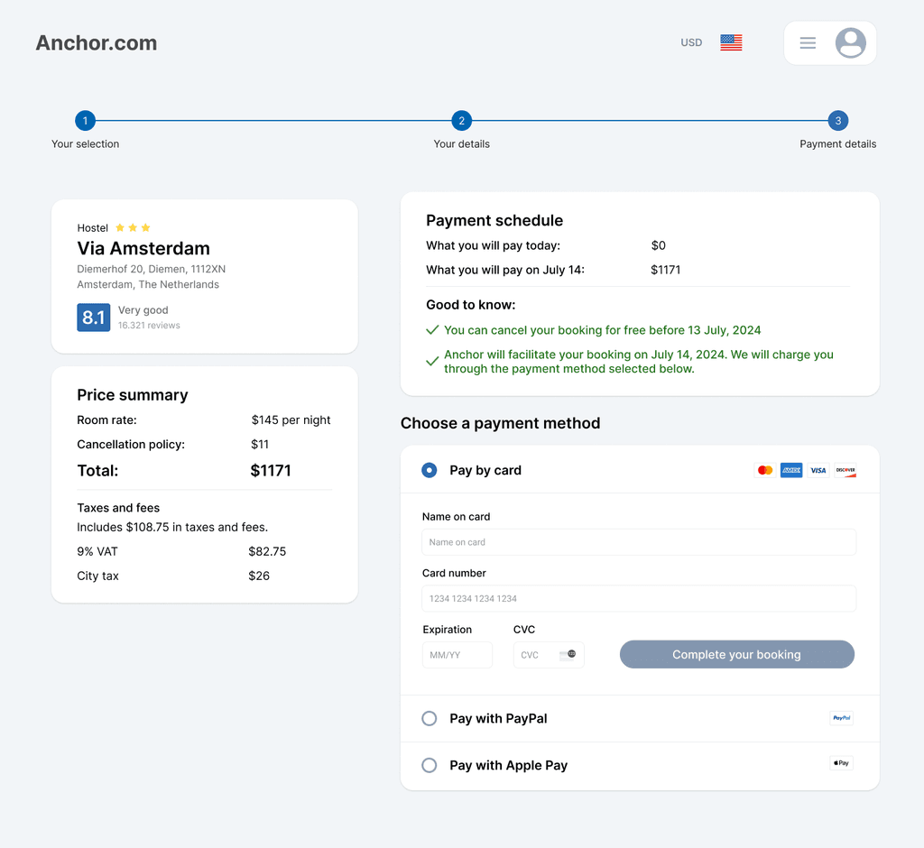
Enhanced booking page
Highlighting the cancellation policy and breakfast selection on the booking page.
Adding functionality for users to modify these options directly from the booking page without navigating back to the room selection page.
Decluttered design
Reducing clutter by removing ads and unnecessary information.
Organising room details and add-ons in a user-friendly manner.
IDEATION
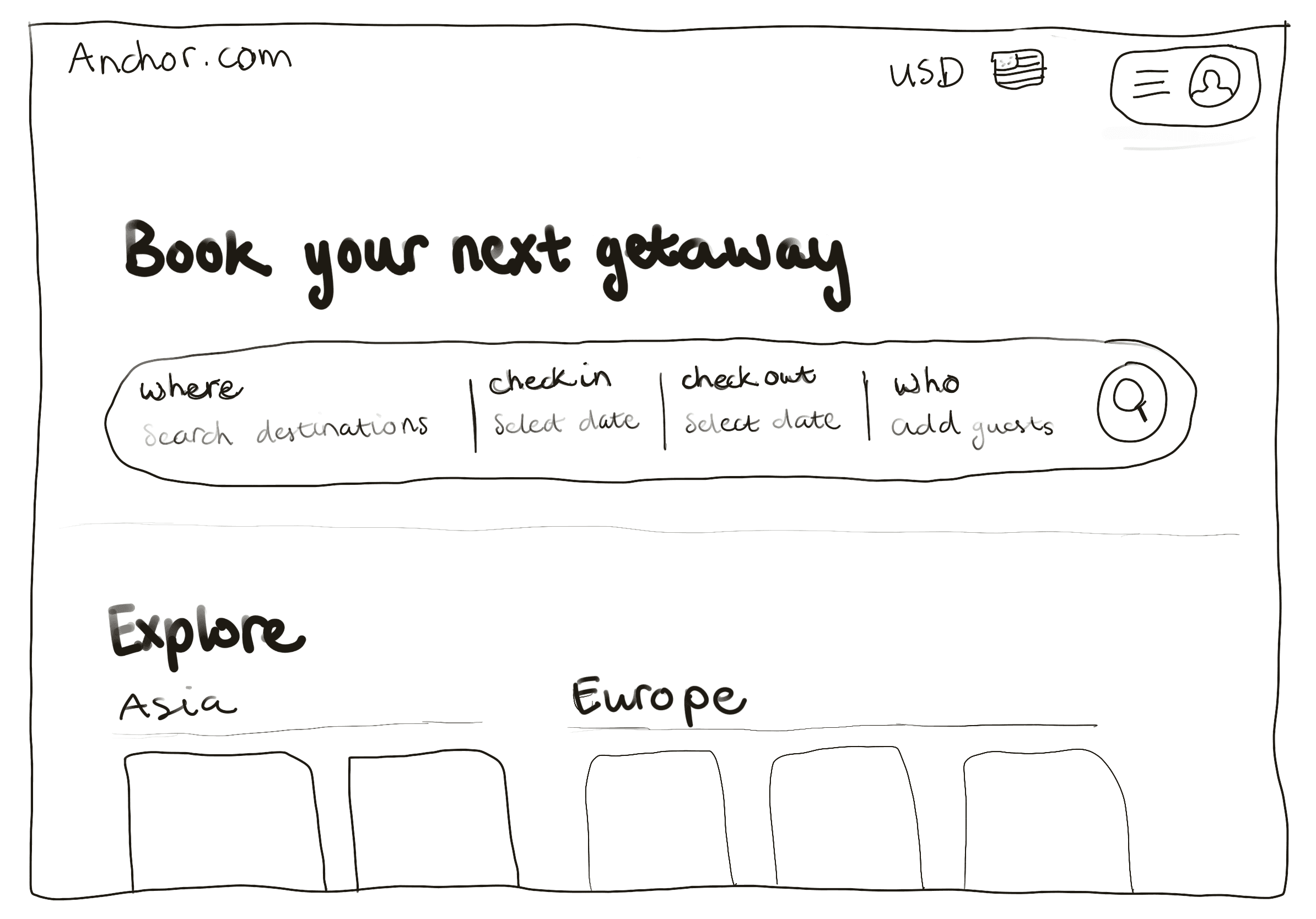
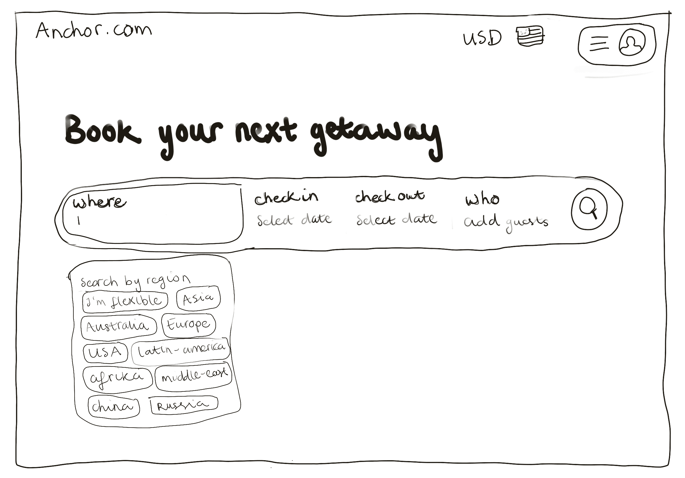
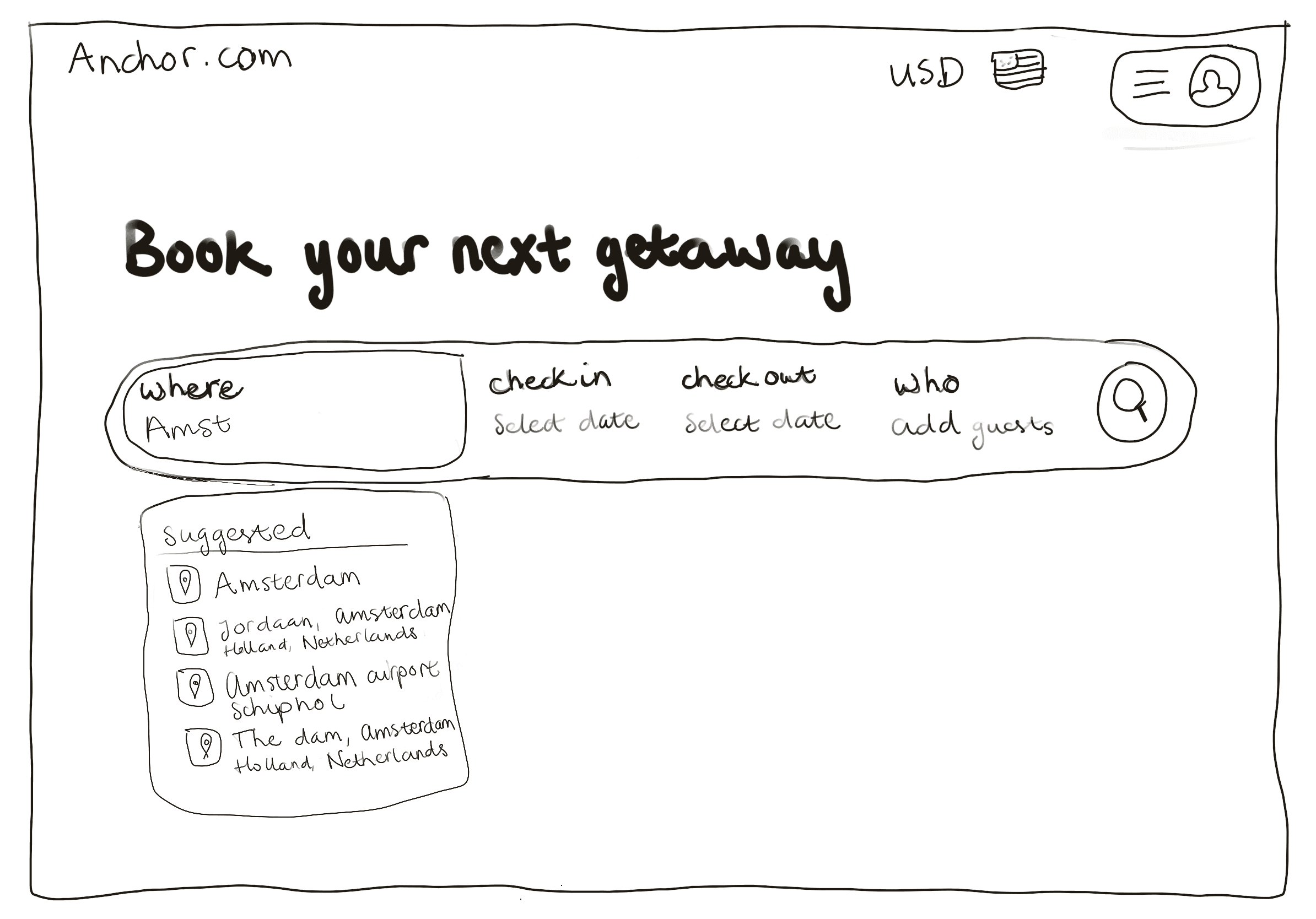
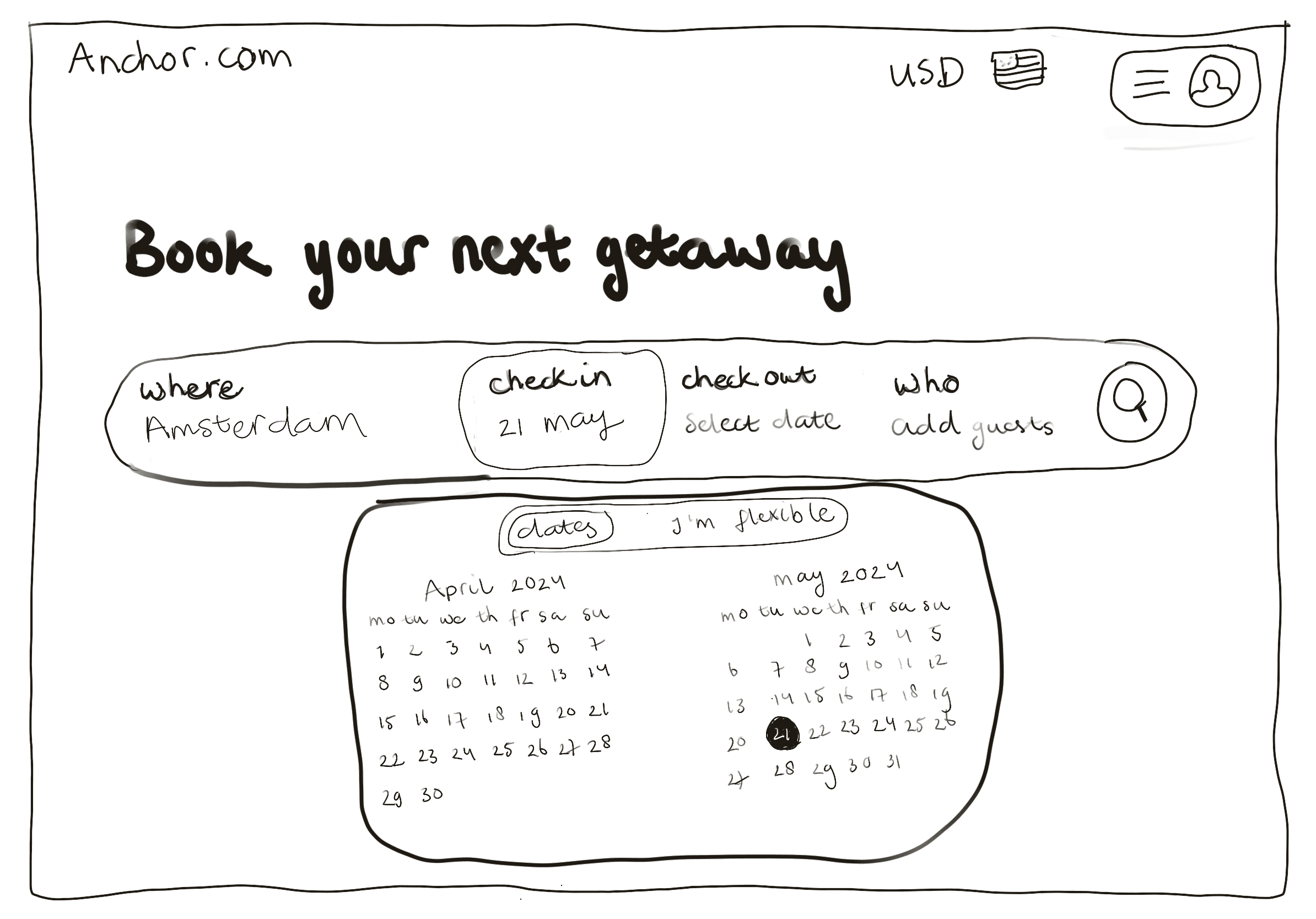
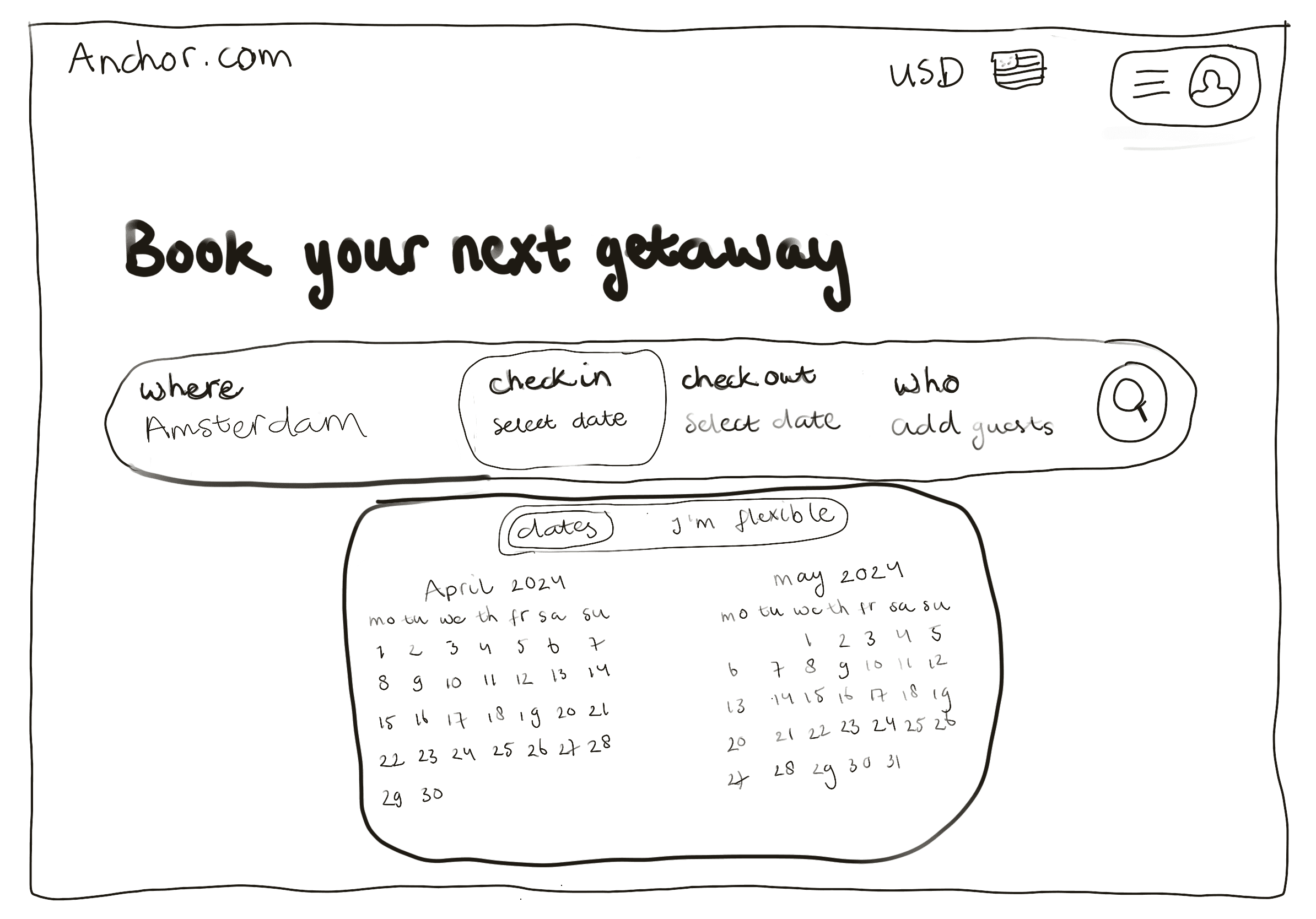
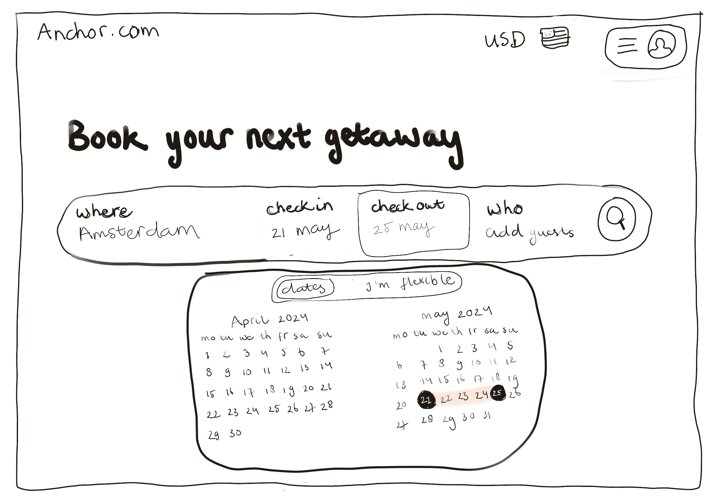
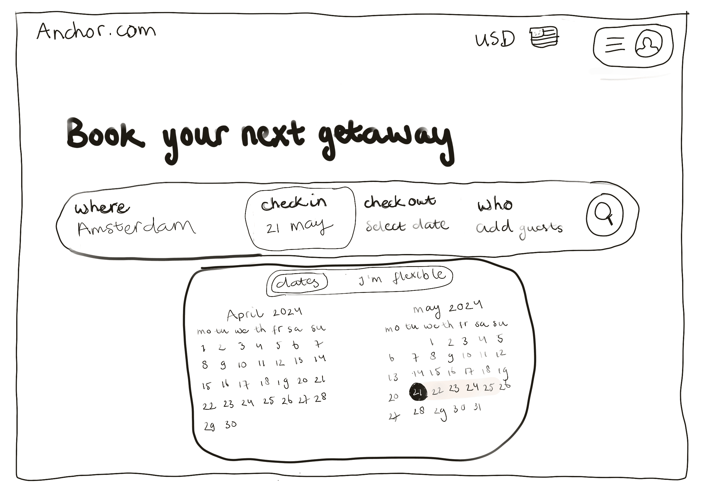
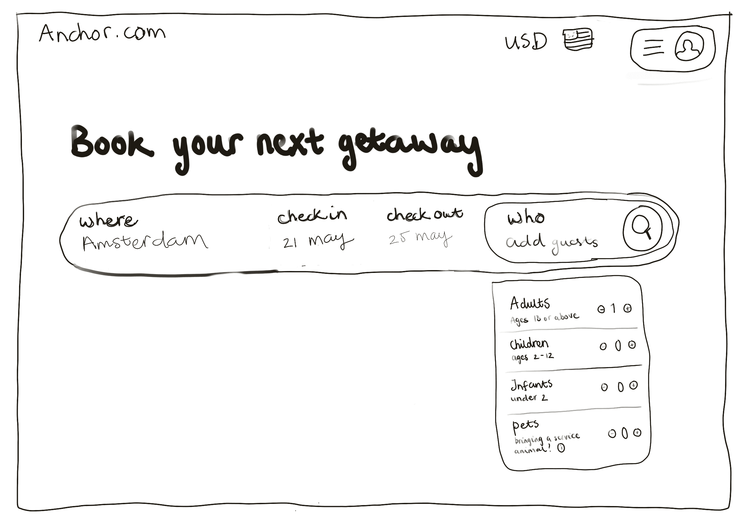
Low fidelity prototyping
Through a competitive analysis of four popular hotel aggregator websites, I identified effective design conventions and layout choices, as well as elements that contributed to usability issues.
I sketched possible design solutions in Procreate before moving to high-fidelity prototyping, allowing for easy iteration and refinement.
IDEATION
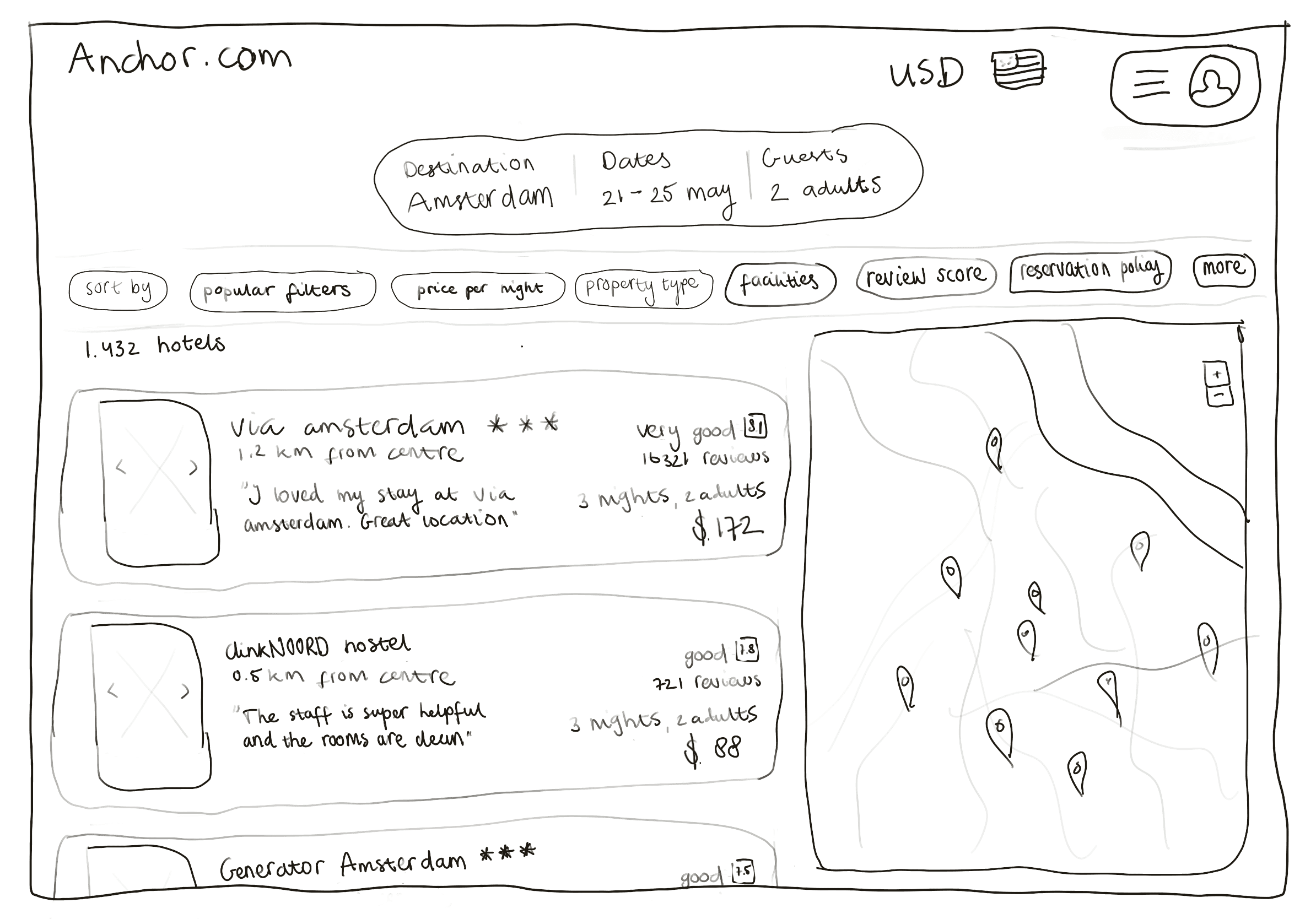
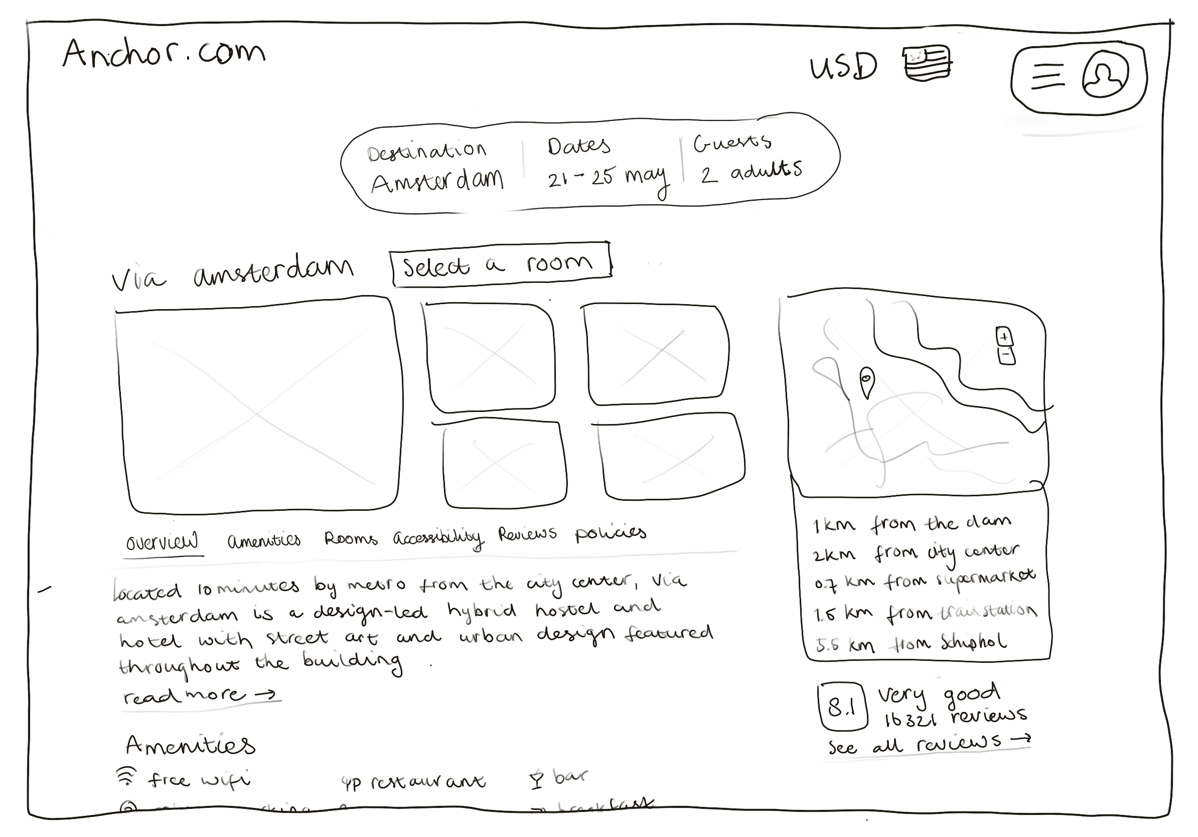
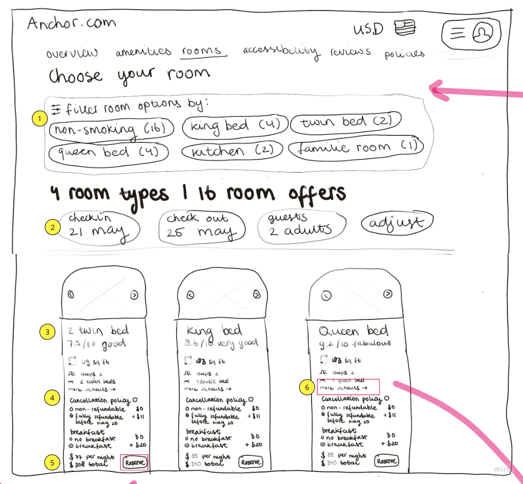
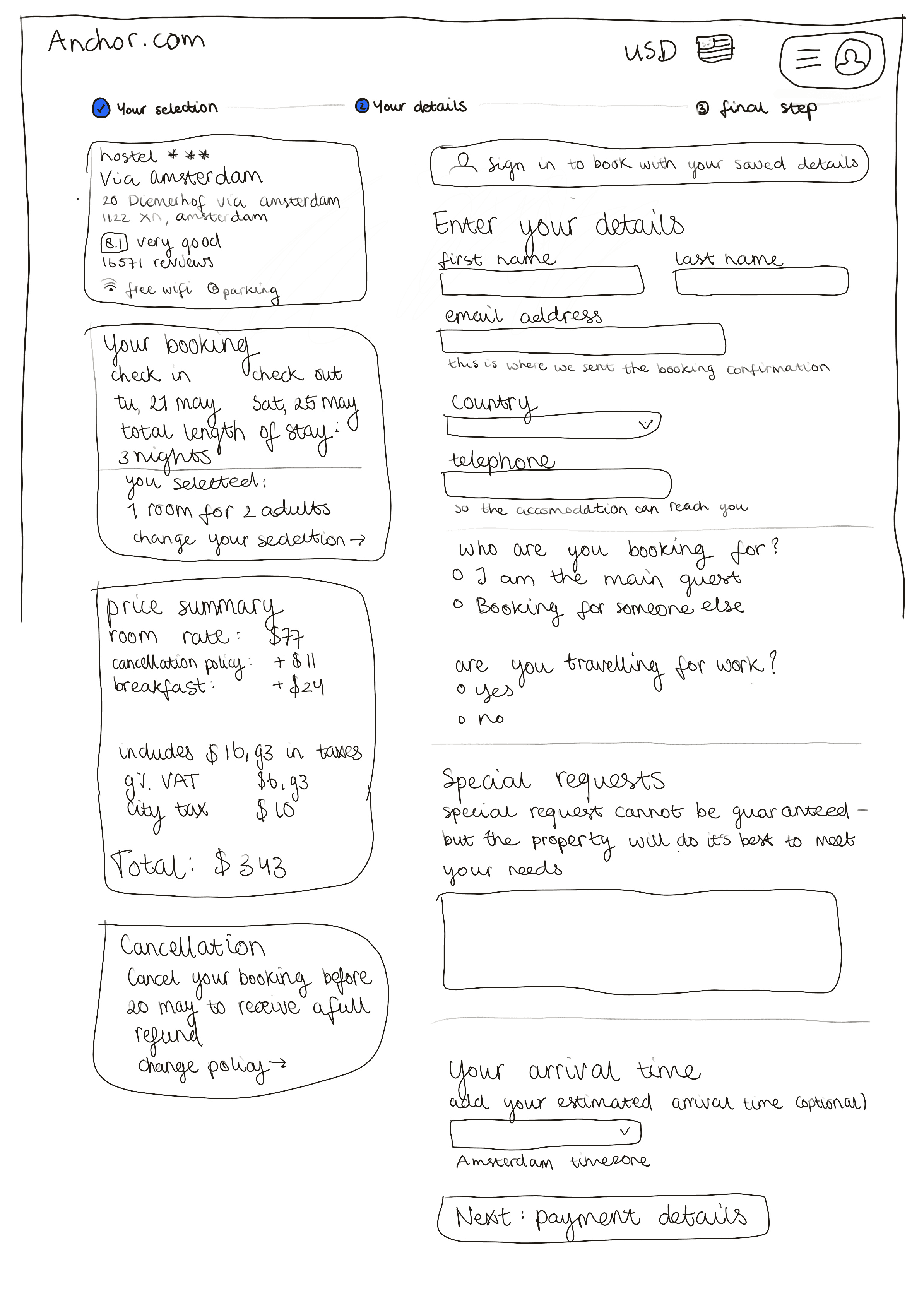
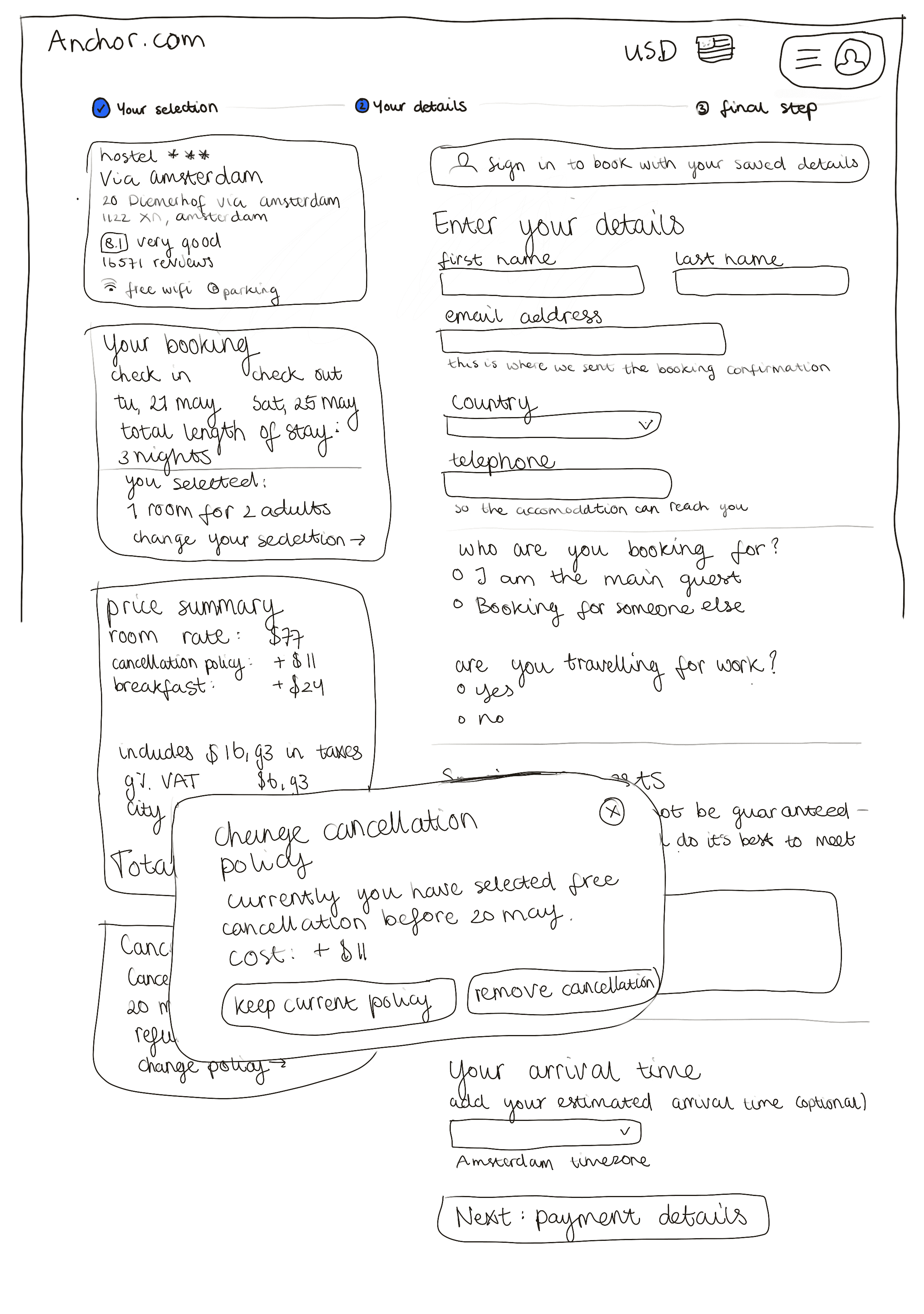
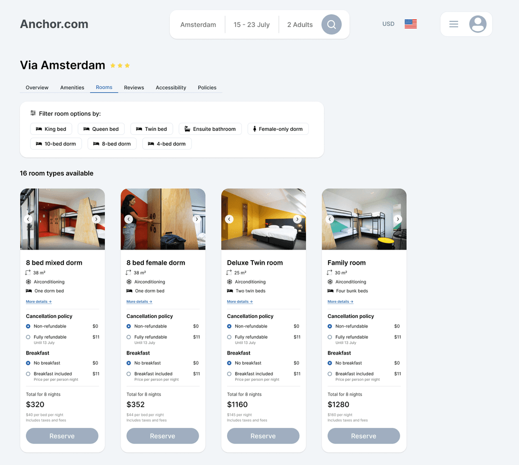
Final screens
Addressing the challenge users have when customising their booking, and the absence of clear and upfront information about what's included in their selection, I redesigned multiple features on the room selection and booking confirmation screen.
Simplified room selection
I added a section that allows users to filter down the room options to find their ideal room faster.
I added the customisation options to the room selection cards, making sure users have a clear choice in their booking customisation.
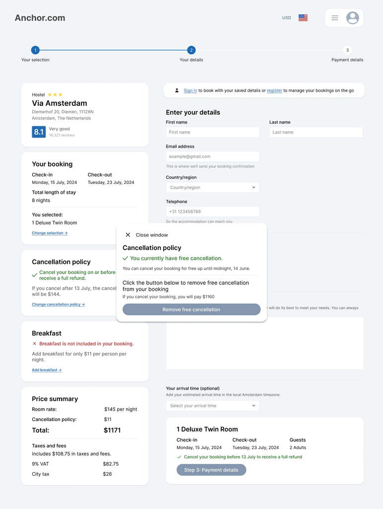
Enhanced booking experience
I added a button to change their initial selection of customisation allowing for easy access to change their initial selection without having to go back to a previous screen or restart the process of selecting a room.
The booking summary now includes an overview of their customisation options.

Functional prototype
I used Figma to create a functional prototype of the redesigned hotel aggregator website. Click on full-screen mode (top right corner) to explore the prototype.
Reflection
I thoroughly enjoyed this project, as it allowed me to practice many different research and analysis methods. I have to admit - I felt lost and unsure during the majority of the research and analysis phase. I wasn't sure how to identify the issue when there's so much data to work with. However, after going over my analysis a few times, I was able to see a pattern and decided to focus on this with my design.
A key improvement for next time would be to do additional research after having this ''aha moment'', to solidify the analysis through triangulation.
I would suggest focusing on:
User interviews to gather deeper insight into user motivations, the context and pain points relating to customising their hotel booking.
Exploring alternative solutions to solving the problem without straying too far from industry specific design conventions.
This approach would increase confidence in the design, ensuring it is centred around users' needs.